When you think of Microsoft, you immediately associate it with some of the best tech innovations, like MS Windows and MS Office. These products are essential for your daily operations, whether you’re writing, presenting, designing, or managing accounting, financial, or mathematical tasks.
Imagine using a PC without these tools! Over time, Microsoft has grown beyond just its Windows and Office software, expanding into products like Xbox for gaming, Skype for professional chat, and LinkedIn for networking.
Even Apple integrates Microsoft Office into its ecosystem. This evolution isn’t just about the products; it’s also about the logo design, which has undergone many changes. The design history of the Microsoft logo is rich and serves as a great inspiration for any designer, showing how a simple design can evolve and adapt through time.
As we delve into this, we’ll explore the microsoft logo evolution and share some valuable tips.
A Modest starting
In 1975, Bill Gates and Paul Allen set the stage for what would become a massive IT giant. Their initial focus was on microprocessors and software, a field they were passionate about from the start. Their journey began with the Altair 8800, an early microcomputer designed by MITS and powered by the Intel 8080 CPU. This was the first major step toward what we now know as Microsoft.
In 1980, Microsoft made a groundbreaking partnership with IBM, marking a significant turning point for the company. This alliance helped them establish a strong foothold in the software market, particularly in supplying software for IBM PCs. This partnership laid the groundwork for Microsoft’s growth and its eventual rise to global prominence.
Fast forward to today, Microsoft is an American MNC with a global presence, employing over 166,000 employees worldwide. Its Windows operating system, the Office suite, and Internet Explorer are staples for many users across the world. They now dominate the SaaS segment with a 17% market share and have grown into one of the trillion-dollar companies alongside giants like Apple and Amazon.
The Microsoft story is truly remarkable, having evolved from a humble beginning with two ambitious founders to becoming a trillion-dollar corporation. Its journey reflects the power of collaboration, innovation, and the relentless pursuit of excellence.
The Microsoft Logo: A Timeless Modern Design
The Microsoft logo has undergone several transformations over the decades, each reflecting the company’s growth and innovation. It all started in the younger days of Microsoft when their design was much more classic and bold, representing their software roots. Early logos were often multicoloured, featuring a grid-like design that was eye-catching and instantly recognizable.
As Microsoft shifted focus from hardware to more innovative technologies, the logo’s design followed suit, becoming more sleek and minimalistic. By the time Windows XP and 98 were released, the logo had evolved into something more refined.
The font changed to a sans-serif style, contributing to a modern and timeless design look, conveying simplicity yet still maintaining strength. The iconic four-coloured block design has remained a key feature, symbolizing the company’s multicoloured and versatile nature across its products and services.
In recent years, the addition of the Segoe font in dark grey has brought a touch of elegance to the logo. This revision continues to focus on minimalism, emphasizing the company’s value and brand in a gorgeous and precise manner. The logo no longer just represents the past but also stands as a beacon of innovation for the future.
1975-1980: – The Disco Period—the initial Microsoft Logo
Back in 1975, Bill Gates and Paul Allen, the owners of Microsoft, teamed up with Simon Daniels, the logo designer, to create the very first Microsoft logo. This early logo was built on the foundation of their work in the early programming language.
The logo was unique at the time, with the word Microsoft separated by a hyphen, giving it a two-level look. The shape and letters of the logo were reminiscent of a Disco music disc, making it stand out as a bold symbol of the time. This design broke from tradition by not being a single line but rather a united yet separated format.
1980-1982: A Heavy Metal Influence

In 1980, Microsoft decided to revive its logo with a bold new design. This time, the company took inspiration from heavy metal bands like Metallica, known for their aggressive and sharp aesthetic. The new logo featured the name “Microsoft” in a single line, emphasizing a sense of unity. The lettering was designed with aggressive diagonals and sharp angles, making the M, R, and F larger to grab the audience’s attention.
Zekek typography, created by Simon Daniel, was used to add a piercing, almost aggressive feel to the logo. It was clear that Microsoft had a strong intention to reinforce its brand visual identity, demonstrating its confidence in creating a better future. Despite this bold step, Microsoft eventually decided to revise the logo again, paving the way for another new design.
The ‘Blibbet’ Era (1982-1987)
In 1982, the Microsoft logo took on a bold new look thanks to a designer who introduced a distinctive element. This design, which became known as the Blibbet logo, featured an O-shape that was both peculiar and bizarre, giving the company a unique identity.
The addition of a horizontal line inside the letter “O” made the logo notable and even resembled a CD, reflecting the company’s connection to the computer world.
This logo design quickly gained fame and achieved extreme popularity, especially among employees. The informal name “Blibbet” was even invented by the company, adding to its charm. However, when the company decided to update its logo in 1987, a petition was started by staff members, hoping the original design would remain unchanged.
The logo had become a symbol of the company’s success, moving away from the rock and roll, hippie, or disco vibe that no longer matched the brand’s personality.
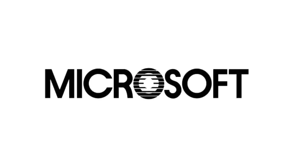
1987-2011: The ‘Pac-Man’ Logo
In 1987, Microsoft introduced a logo that became synonymous with its business identity for over two decades. The design was inspired by the iconic Pac-Man video game character, known for its round shape and mouth that appeared to “eat” a part of the letter. This logo featured a thicker and softer look, signalling a shift in the company’s evolution.
The appearance of the logo was clean and mesmerizing, with the letters appearing in a Helvetica font, giving it a modern feel. The O and S letters in the word Microsoft were especially notable for their unique thickness and the softness they portrayed. This symbol worked as a strong assertion of the company’s growth, suggesting both speed and potential.
As a logo design company at the time, Microsoft’s choice of elements for their logo reflected a deep understanding of marketing strategies. The slash between the two words “Micro” and “Soft,” became an integral part of their brand identity, which was instantly recognizable. For 25 years, this logo stood as a powerful notion of self-assurance and passion, perfectly aligned with the company’s development in both hardware and software.
The logo wasn’t just a symbol—it was a messaging tool that encapsulated Microsoft’s forward-thinking vision and role in the ever-evolving computer world. The design’s simplicity and softness made it universally appealing while still exuding an air of confidence.
2012–Present: The Window Logo
In 2012, Microsoft made radical alterations to their logo, marking the beginning of a new era for the company. The redesigned logo featured four colourful squares, symbolizing window panes. This fresh look replaced the previous design and aimed to reflect the company’s broader vision, encompassing a range of products and services. The colours—blue, red, green, and yellow—each represent key Microsoft offerings like Word, Excel, Xbox, and Outlook.
The logo’s new style was more geometric, with a rounded yet clean, modern look, using the Segeo font. This change aligned with Microsoft’s focus on software and technology in the business world. By incorporating window panes, the logo now symbolized a representation of Microsoft’s commitment to innovation.
This redesign wasn’t just about aesthetics; it was a message about Microsoft’s position in the market. The logo now serves as a single-use symbol, combining the brand’s identity with its business values. The shift emphasized the company’s digital-first future, aligning with its focus on software companies like Office, Bing, and their gaming platform, Xbox.
The new design was part of a larger collaboration, a project that included input from graphic designers, focusing on logo development that could speak to Microsoft’s evolving identity and growing influence in the industry. This was more than just a visual change; it was a clear indicator of Microsoft’s drive to stay at the forefront of technology and business operations.
Consider These Steps While Designing A Logo
When designing a business logo, start by understanding the target audience. Consider the cultural and psychological factors that may influence how they perceive your logo. For example, colours and fonts play a significant role in conveying the brand message. The colours should align with the values and brand message you want to portray. Use simple but notable design elements to make your logo easily recognizable.
When choosing design elements, think about scalability. A good logo should look great whether it’s displayed on billboards or small mobile phones. It must be versatile enough to adapt to various formats, such as websites or social media. Keep in mind that your logo should be clear, even when displayed in larger or smaller sizes.
Incorporate the right shaping and fonts for balance. Don’t forget that your logo will be seen by viewers with a range of attention spans. A clean, simple design often works best. Avoid overcomplicating things to ensure attention stays focused on the core of your brand identity.
Lastly, always keep an eye on rivals in the industry. Seeing how they design their logos can give you insight into trends, but don’t copy. The goal is to create something unique that represents your brand’s characters and values.
“8 reasons to hire a logo design agency” is a great way to highlight why professional expertise matters in crafting a perfect logo.
Final Thoughts
Microsoft’s logo has always been a remarkable symbol for both startups and SMEs in the tech industry. Its journey from a basic design to the iconic four-coloured window logo shows how companies must constantly adapt to current trends. This evolution is a true inspiration, showcasing the importance of a redesign to remain recognizable and stay at an unreplaceable level. The design has evolved to reflect the changes in the market, proving that a logo is much more than just a symbol; it’s part of a company’s identity.
Also Read: The History of Starbucks Logo: Evolution and Design Secrets and 7 Types of Logo and How to Use Them (With Example)