In the global coffee industry, Starbucks emerged as a powerhouse that would dominate over 35,000 stores worldwide. Their branding effort wasn’t just about selling a product; it was about creating a recognizable service that would brew success through a synonymous logo that springs beyond mere shop boundaries. The history of the Starbucks logo showcases the evolution of their visual identity, reflecting their journey from humble beginnings to a globally recognized brand.

From its early designs to the current emblem, Starbucks fought to nail a brand that operates with strategic development, showing how a simple name can transform an entire worldwide company.
Their journey reflects a successful narrative of exploring visual identity, where each design element tells a story of innovation and market establishment
First Era: 1971-1987

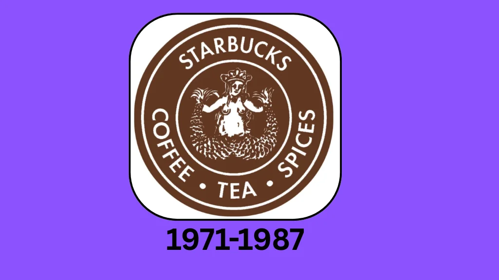
In 1971, three friendly entrepreneurs opened their first store in Seattle, drawing inspiration from Moby-Dick’s Pequod. Jerry Baldwin, Zev Siegl, and Gordon Bowker created a brand to attract coffee lovers. The traditional mermaid logo symbolizes the Siren’s call to sailors in Greek mythology. It captures the essence of maritime adventure and caffeine passion
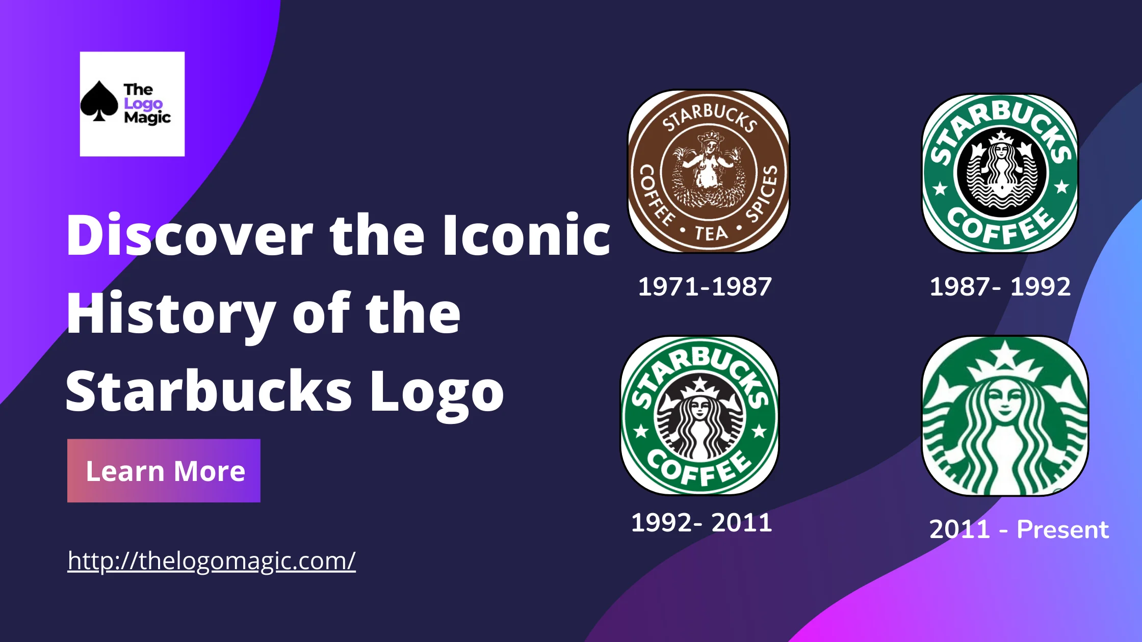
The original design featured a circular emblem with an ornate siren, visible in intricate details and minor accents, inscribed with text about roasted coffee beans and spices. This initial logo balanced modern typography with a stable, nurturing aesthetic that would exit beyond a mere company name, becoming a recognition of brewing innovation.
Transition Period: 1987-1992

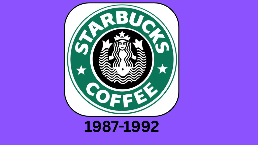
In 1987, Howard Schultz embarked on a revolutionary journey to transform the Starbucks logo, hiring Terry Heckler, a visionary artist, to differentiate the brand.
Inspired by Seattle’s spirit and Milan’s coffee culture, they sought to create a memorable visual identity that would revolutionize the coffee industry beyond a coffee shop or cafeteria.
The redesign introduced a streamlined logo with green symbolizing fresh growth and prosperity, simplifying the previous complex design. By discovering new visual language, Schultz envisioned a space that would connect espresso lovers, replacing the old wordmark with a more stylized representation that spoke to United States coffee enthusiasts and their desire for a unique menu experience.
Expansion Era: 1992-2011

In 1992, Starbucks embarked on a significant design transformation that would reimagine its logo during a period of global expansion. The mermaid logo underwent a professional close-up, zooming into her form and creating an intimate visual that removed detailed elements while maintaining the familiar modern appearance that customers had grown to love.
This significant moment revealed the impact of their logo’s deep connection with consumers, demonstrating how sharpened visual design becomes more than just a tail or body but a fundamental part of brand identity.
Modern Era: 2011-Present

In 2011, Starbucks made a significant shift in its logo design, marking a turning point for the brand’s image. This new direction embraced minimalism, with the focus shifting almost entirely to the Siren. The stars, wordmark, and outer ring were removed, leaving behind a clean and modern look that was more symbolic than literal. The Siren was enlarged, receiving a facelift that included adjustments to her eyes, nose, and hair to make her more symmetrical and appealing to a broader audience.
These subtle yet impactful changes allowed the logo to have a versatile and approachable feel, which made it more relevant to consumers around the world. One notable change was the repositioning of the Siren’s face, creating a more realistic and asymmetrical appearance that felt more connected and human.
The green background colour, previously seen behind the logo, now surrounded the Siren, enhancing her presence and the overall vibe of richness and quality. This design also celebrated the 40th anniversary of Starbucks, acknowledging its growth into an iconic brand. The design work was executed by Lippincott and the in-house design team, both of whom played a vital role in making this redesign a success. This update was crucial to maintaining Starbucks’ connection with a modern audience while staying true to its origins.
Also Read: The Evolution of the Amazon Logo: A Journey Through Time
Successful Design Key Elements of the Starbucks Logo
The Starbucks logo has evolved, but its unique and recognizable mascot has always been at the core of its brand presence. Inspired by a 16th-century Norse woodcut of a two-tailed mermaid, Terry Heckler crafted the original Starbucks logo, which was inspired by the old marine book. This connection to the past helped create a logo that is inseparable from the brand, especially in the coffee world. From the very start, their logo was tied to the brand in the strongest possible way. There was never a Starbucks coffee without this iconic image.
Design Component By Shape

The Starbucks logo has always had a circular design, which is often chosen in graphic design for its symbolism of eternity and everlasting. A circle has no clear beginning point or end point, making it an ideal visual representation of the brand’s endless connection to the coffee industry. The brand name and wordmark were initially placed inside this shape, adding to the overall feel of timelessness. The enlargement of the Siren and the removal of five-pointed stars marked a significant shift in the design. Yet, the circle version remained intact, maintaining its connection to the brand’s long-lasting identity.
In the evolution of the Starbucks logo, the circle not only represents the continuous movement of time. It also reflects a deep association with nature and the earth. The green colour in the logo is often linked to being eco-friendly, safety, peace, and a commitment to the environment. This approach aligns with the brand’s legacy of sustainability, as seen through its emphasis on trees and preserving nature. The circle also evokes the idea of movement, reinforcing the idea of a legacy that keeps going.
The Starbucks logo has remained a recognizable symbol due to its use of a circle to represent various concepts. From its earlier designs with stars to its modern, simplified zoom of the Siren, the logo’s circle structure reflects both history and a forward-thinking vision. As a designer, I’ve always appreciated. How circles in logo design convey an idea of timelessness, continuity, and connection to a larger purpose, much like Starbucks continues to grow in its influence worldwide.
Design Component By Color

Initially, black was also part of the logo, but green now serves as the background colour, while white is used in the wordmark and typeface.
The use of green is not just a design choice; it carries deep meanings of nature, healing, and protection, which are strongly associated with the brand’s connection to coffee, a plant genus.
The choice of green also reflects the company’s efforts to be seen as socially responsible. Over the years, Starbucks has been ethnically sourcing its coffee and fostering friendly relations with both local farmers and consumers. This makes sense, as green also signifies wealth and social responsibility, both of which are key aspects of Starbucks’ brand image.
By using green, the company wants to convey its commitment to being a responsible business and maintaining cordial relations with its stakeholders.
The dominant colour in the logo represents much more than just aesthetic appeal. It is an iconic symbol of Starbucks’ role in the world as a company focused on ethical practices, which is further emphasized through the siren symbol that completes the logo.
Design Component By Font

The Starbucks logo has evolved, with one significant change being its font. Initially, the logo had bold block letters in a sans-serif font, making it simple and easy to recognize. As Starbucks grew into a global brand, the company realized it didn’t need text in its logo anymore. The logo itself, now featuring only the iconic Siren, became instantly recognizable.
Earlier versions used a clean, polished style with block letters and subtle details like five-point stars and dots. As the company solidified its position in the food and beverage industry, it confidently embraced a more minimalist approach.
Conclusion
The Starbucks logo is a perfect blend of simplicity and recognition. It’s unique and easy to recognize, which makes it stand out in the crowded world of coffee and beverages. Currently, the logo is straightforward, with no wordmark, dots, or stars—just a captivating Two-Tailed Siren with Thick Tails and flowy locks. The green and white matching colour schemes are not just aesthetically appealing but also reflect the company’s socially responsive approach.
Over time, the evolution of starbuck logo has seen elements being added and subtracted. Which proves that Starbucks is always following the design trends in the Food and Beverage Industry. This constant change shows that the company remains up-to-date and always in touch with the needs of its customers. Just like how Starbucks keeps its branding fresh, you can get inspired to brew your business logo design. The logo continues to evolve, reflecting the times and maintaining its status as a global leader.
