Over the decades, the Puma logo has undergone a fascinating evolution, becoming an iconic symbol that represents the world of sports, apparel, and footwear. From its humble beginnings, the design has gently transformed, maintaining its remarkable emblem that captivated fans and audiences alike.
As the company grew, the logo remained identical, with only minor improvements to make it more recognizable across all products like shoes, shirts, and other. It has become a big part of how the brand is advertised and supported globally, securing a lasting existence in the market. Today, it’s an emblem that stands out, still evolving while staying true to its core.
What is Puma?
Puma, a global giant in the sportswear and footwear industries, was founded in Germany in 1948. Known for its premier products, the brand has reached every corner of the globe with boutiques spread across all continents. From its humble beginnings, Puma has become one of the leading companies in its sector, selling its products worldwide.
Puma Logo History
Puma’s roots trace back to 1924 when the Dassler Brothers shoe factory was first established. This public company, built by two brothers, quickly gained recognition for its innovative designs, especially the soccer cleats it introduced in 1925. The product was a game-changer in the athletic footwear industry, offering superior traction and comfort. The business grew rapidly, and by 1926, a big factory was built to meet rising requests for novelty items.
However, internal discord led to a split between the brothers in 1948, resulting in the creation of two iconic brands. One brother founded Adidas, while the other rebranded their side of the business as Puma. The Puma name debuted with the introduction of Atom soccer boots, which were quickly worn by players on multiple national teams. The brand saw great success post-World War II, gaining prominence on the global stage.
However, by the 1990s, financial turmoil tarnished Puma’s brand image, and it became perceived as uninspiring and unoriginal. But then came Johan Seitz, the CEO, who revived the brand by repositioning it as a symbol of style and innovation. Puma regained its leadership in the sports sector, solidifying its place as a prominent and iconic brand once again. Now, the Puma logo is a recognizable symbol seen across the globe, a testament to its enduring legacy in the athletic industry.
The Origins of the Puma Logo
When Rudolf Dassler, the founder of Puma, created the brand’s logo, he wanted it to reflect the spirit of an athletic predator.
The wildcat symbol was chosen to represent the agility, speed, and flexibility of athletes striving to reach their aspirations. Initially, the logo had a wildcat leaping through an elongated letter D within an irregular hexagon.
Over time, the design went through several reforms and was eventually simplified, with the wildcat now frozen mid-leap in later editions. This iconic design was meant to inspire the qualities of endurance and the raw energy of athletes, perfectly aligned with the company’s motto of liberty and speed.
The renaming of the company also contributed to its rebranding, cementing Puma’s position in sports apparel and gear for high-performance athletes.
The Logo from 1948 to 1951
In 1948, the Puma logo underwent a bold transformation. The iconic white cat was now leaping across a stylized white letter set against a new black hexagon with a horizontally extended base. This version of the badge lasted for less than three years before it was refined and revamped in 1951. The changes gave the logo a more dynamic, modern look that represented Puma’s evolving identity.
1957-1958: The Transformation of a Brand Icon
In 1957, Puma unveiled a new logo design, which featured a bold shift in its aesthetic. The cat and the letter were now colored black, while the hexagon background turned white, giving it a more refined look. Outlines around the logo were bold, and it was framed within a thick white frame. This version marked a significant distinction, with capital serif lettering surrounding the perimeter of the logo.
In 1958, the design evolved further, with the incorporation of geometry and additional lettering within a double hexagonal frame. The inscription RUDOLF DASSLER SCHUFABRIK was added to the outer rim, while the iconic wordmark PUMA in bold font with rounded lines sat below the leaping cat figure. This design, while a major milestone in history, didn’t quite capture the gracefulness and flexibility the brand intended, as some critics felt the cat’s size didn’t fully express the vision of endurance.
During this period, FORMSTRIP—a crucial element for footwear—earned its patents, aligning perfectly with the rise of media and platforms that amplified Puma’s presence in the world of apparel.
1968-1970: Revamping the Puma Identity
In 1968, Rudolf Dassler, frustrated with Puma’s outdated shoe designs, decided to transform the brand’s image. He wanted the logo to reflect the brand’s essence, symbolizing agility, endurance, and the strength of a predatory cat. To bring this vision to life, he hired caricaturist Lutz Backes. Backes, under the guidance of Dassler’s vision, skillfully combined the form of a black panther with the paws and head of a puma to create a unique, dynamic new logo. Initially, Backes was offered a commission of just 1 cent per product sold, but he rejected this offer, instead asking for a lump sum of 600 marks, alongside a sports bag and a pair of shoes as part of his payment.
1970-1974: The Beginning of an Iconic Change

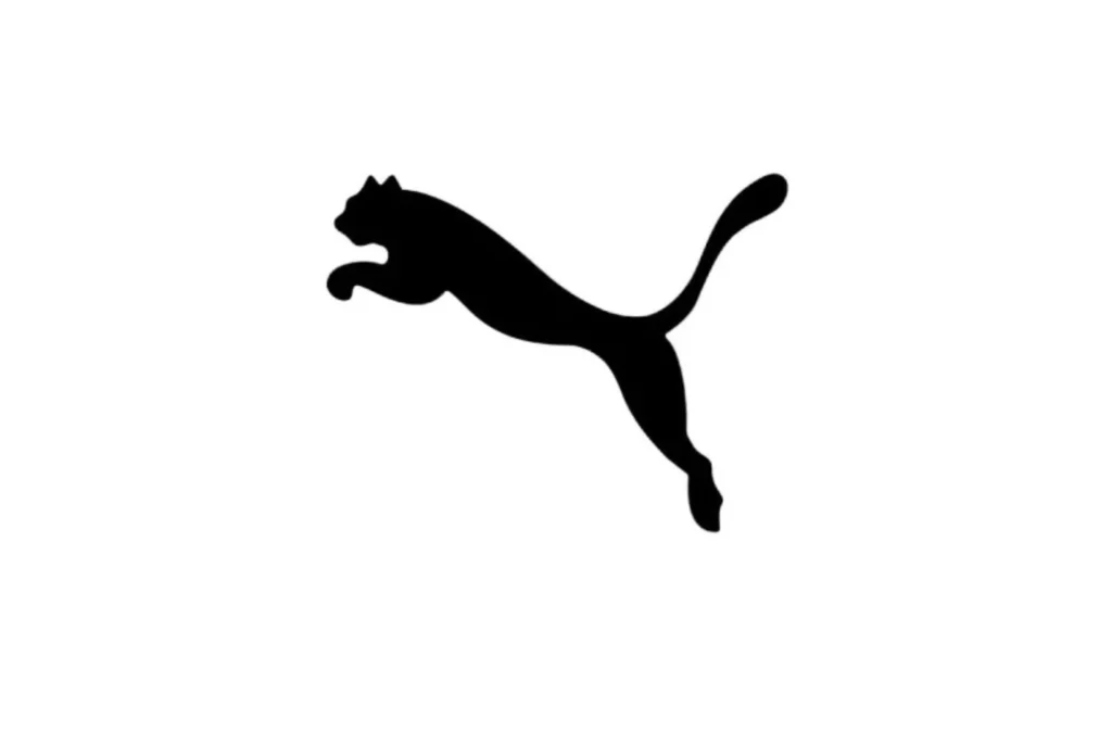
In 1970, the Puma logo went through a big change, marking the genesis of what would become an iconic emblem. The logo’s design shifted to a vertically oriented style, reflecting a more modern and dynamic appearance. The primary hue transformed from black to white, giving it a cleaner, sharper look. The silhouette of the Puma became more refined, with a delicate black contour that added an extra touch of elegance and gracefulness. This design also stood out as one of the few Puma badges without any lettering, keeping the focus on the image alone, which helped cement its distinct identity.
1974-1976: New Design Direction
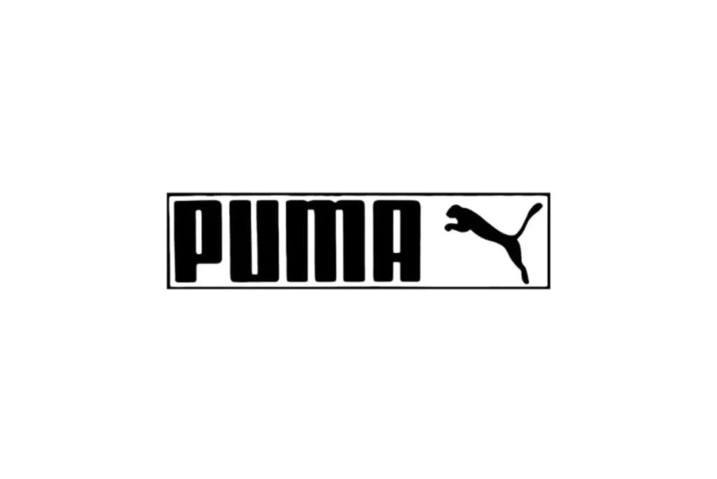
In 1974, the Puma logo saw a shift towards a more modern look. The jumping cat was now depicted in black, positioned to the right of a bold wordmark. This new logo had a rounded font without the pointy ends, giving it a smoother and cleaner feel. The overall design was framed in a rectangle with a bright background, adding contrast and making it stand out.
The next version, introduced in the same year, had a lively green backdrop. The pale yellow inscription was centered, and the logo was set in a horizontally oriented rectangular shape, resembling a banner. The leaping cat was also in yellow, while a football boot illustration appeared in the left corner, using complementary official colors to create a sense of dynamic balance. However, this logo didn’t last long. Within a couple of years, it was rapidly replaced as Puma worked to refine its brand aesthetics, marking a significant change in the brand’s evolution.
The Puma Leap: 1976-1978 Edition
In 1976, Puma introduced a new look for their logo, marking the beginning of a major evolution for the brand. The iconic leaping cat, designed with a sleek and dynamic plunging line, symbolized the brand’s focus on athletic performance and innovation in casual footwear. This new logo edition, which was released in 1978, reflected the brand’s growing recognition as a leader in the world of sports. The Puma name gained further prominence as the logo became synonymous with quality and speed, leaving a lasting impact on the world of sportswear.
The 1978-1980 Puma Logo Design
In 1978, Puma’s logo became a symbol of the brand’s image. The leaping Puma cat was placed above the wordmark, and it covered the upper side of the “M” and “A.” This design, drawn on a plain white background, resembled a previous 1974 iconic badge. The Puma cat looked strikingly similar to the leaping Puma in this 1978 edition, setting the basis for the brand’s identity. With nothing else around, it was clear and merely iconic, focusing solely on the dynamic cat.
Puma’s Evolution in the 1980s (1980 – 1988)
In 1980, Puma made a major shift by removing the wordmark, leaving the powerful Puma cat as the sole symbol of the brand’s strength. This standalone logo quickly became an iconic representation of Puma’s identity. From 1982 to 1988, the wordmark was reintroduced with a delicate change, now incorporating a white colors shade to match the famous form strip, creating a new fusion of the brand name and the leaping cat. This revised logo design lasted for six years, strengthening the bond between the brand and its unique visual identity. The enduring nature of this logo speaks to Puma’s legacy and its ongoing evolution.
1988-Present Adjustments
In 1988, the company made a significant adjustment to the Puma logo, eliminating the white form strip from the wordmark. Despite this change, the emblem still retained the essence of the brand, with the iconic leaping cat and the brand name side by side. This edition of the logo has remained true to its identity, continuing to represent Puma boldly and recognizably. There are also lesser-known facts about the Puma logo that are definitely worth exploring, adding depth to the story of its evolution.
Main Factors to be aware of about the Puma logo
The Puma logo is recognizable across the globe, making it synonymous with high-quality footwear and athletic wear. It has evolved over time and is closely tied to Puma’s brand history, which its audience easily recalls — from iconic cricket shoes to the development of its modern design.
Our expertise in graphic design has assisted numerous company founder globally, crafting logos, websites, and social media posts that perfectly represent their brands across the digital space, including banners.
Puma’s logo stands out for its simplicity, history, and development, marking it as a significant icon in the world of sports and lifestyle brands. These three factors are sure to pique your interest when you learn more about them.
The Initial Puma Logo Design
Back in 1948, Puma introduced its initial logo, which was quite different from what we see today. At the time, the letter D was prominently featured in upper case, symbolizing Rudolf Dassler, the business progenitor. The design had a puma animal leaping through the D, bringing a sense of energy to the logo. The image was monochromatic, lacking much of the aesthetic appeal we’re used to, but it still captured the attention of audiences. A later version included the word Puma, and the logo was often displayed within a hexagonal frame, adding to its visual impact.
The Misunderstood Icon: The Form Strip vs. The Logo
At one point, the form strip shoe was often misidentified as the logo, causing some confusion in the recognition of the brand’s iconic symbol. This well-known component of Puma’s design, closely linked to their business, was so deeply associated with the actual logo that many individuals mistakenly thought it was the symbol itself, reflecting the brand’s acclaim.
The form strip was more than just a design element; it served a particular function. It was incorporated into athletic shoes by manufacturers who were combining lightweight materials to enhance performance. However, the limited control over foot motions during intense sprints and kicks required something more—this construction helped athletes move swiftly and perform actions on the field.
In 1958, Puma made a significant move by introducing footwear with the form strip. The leather strip placed along the side of the shoe provided much-needed support to the players’ feet, helping them to move more rapidly during their games.
At that time, the company provided a clear description of the form line on the shoe, highlighting how it safely cradles the foot without restricting its natural motion. This innovative design also prevents excessive pressure from affecting the leather, ensuring that it doesn’t stretch toward the side or heel. Additionally, it played a vital role in preventing ankle twisting, offering a stable and comfortable fit for athletes.
The “No. 1 Logo” – A Bold Design from 1968
In 1968, the Puma logo was officially designated as the “no. 1 logo.” The iconic design featured a cat leaping above the wordmark, symbolizing agility and strength. It’s fascinating how a logo can embody the core values of a company so perfectly and become instantly recognizable worldwide.
Over the years, the company has maintained the original design with only minor changes. Some of these include eliminating the eye and nuzzle while making the ears of the cat more prominent to enhance its fierce look. Despite these small tweaks, the essence of the design remains unchanged, reflecting the brand’s enduring legacy.
Key Design Features of the Puma Logo
The Puma logo stands out with its sleek and easy design, instantly recognizable by its black color and remarkable Puma picture. It represents quality, complemented by a simple typeface and a cheerful visual that can be spotted anywhere. The overall design elements make it a true icon in the world of sports branding.
Colors
The Puma logo is iconic, often displayed in black to represent the brand’s athletic strength, but it also reflects agility and rivalry in sports. Depending on the context, the firm uses varied colors, such as a white logo on a solid red background or a dark navy and white mixture, signifying the fruition of the logo over time and aligning with Puma’s vision of being a global leader in athletic products.
Imagery and Design Choices
When we talk about Puma’s logo, it’s evident that the shapes and styles they choose reflect the company’s core ideals. From rectangles to a simple PUMA pic or just the name, each version captures something powerful about the company. The iconic silhouette of a puma cat has become a regular motif, representing speed, agility, strength, and endurance qualities that their products embody.
In a fast-moving market, the brand has carefully tailored its designs to appeal to sports fans while emphasizing traits. If you’re looking to create your unique logo, thinking about customized elements like color, style, and font preferences is key. This is where a creative graphic design studio, such as The Logo Magic, can help with their logo designers, offering fresh ideas that align with your business vision all while staying within your budget.
Font Choice in Puma’s Logo Design
The Puma logo has evolved, and the name’s lettering plays a significant role in this evolution. Initially, the brand used a sans-serif typeface with bold capital letters that gave the logo a strong presence. The font choices, such as FF SOFTSOUL STD BOLD and QUANDOR REGULAR, were tactfully selected to match the brand’s nature and vision.
In some versions, rounded edges were used to soften the appearance, balancing the boldness of the design. Experts speculate that these fonts were carefully chosen to enhance the image and make the logo more memorable. It’s also interesting to note how these fonts have been seen in different forms. How they relate to the overall design concept, offering a modern yet timeless touch.
The Final Verdict: A Resilient Icon
The Puma logo is highly valued in the sports industry, symbolizing strength, agility, and speed across shoes and apparel. Over time, its minor changes have ensured the renewed look that will continue to perform well for generations to come, keeping the company at the forefront of the market. The logo’s unique design captures the focus on agility, making it a winning icon in the sports industry.